This post may contain affiliate links. Please read our disclosure policy.

Hi guys!
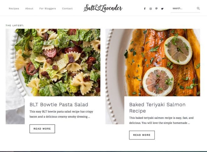
Just popping in to explain why the blog looks a little bit different today. 🙂 I’m excited about the new look, and I hope you will be too.
It was very important to me that I maintained a sleek, minimalist site where the focus is on the recipes. I don’t want the site bogged down with a lot of useless stuff that makes it harder to navigate and slow. This is especially important for the many people who use their phone to view my blog.
Read on if you want to know more details.
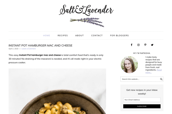
The Old…
Why?
Well, long story short, my blog’s old theme was outdated. I’ve used the same theme since 2015, and that’s like forever in computer years. I was hesitant to change until I got to the point where routine updates were breaking things on my site. I could have upgraded to a newer version of the same theme to retain a similar look, but that had its own share of issues. I won’t get into them since that’s kinda boring, but suffice it to say that going with a fresh new look was more appealing.
I’ve spent many hours in the past few weeks tweaking the new design. There may still be some bugs/issues, so please send me a note if you find something that looks off.
I’m looking forward to bringing you more great recipes and also engaging new readers with an easier-to-navigate, faster site! As always, you can find all of my recipes in my recipe index.


Congrats Natasha!
Thanks, Holly!! 🙂
Well, I guess it looks okay. Just kidding it’s beautiful. Now that you’re done with tech stuff, can you make me lunch?
No.